
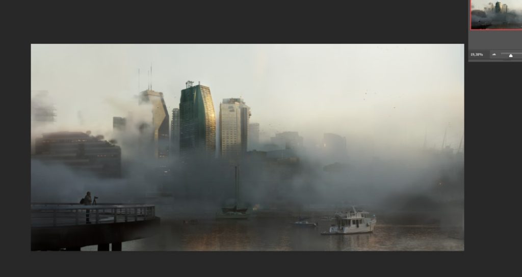
In today’s post we want to present you the complete process of one of our visual architecture projects: RiverFog.
It is a very fast production that helps us to generate extra images to clients or convince them of the choice of views.
Want to know how we did it, read on!
REFERENCES/MOOD
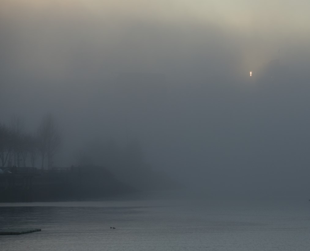
We love foggy images, we know that there was disagreement about this kind of images a few years ago, but in our opinion foggy images have something magical.
Clients do not usually ask us for these kind of images but we really enjoy recreating them.
It’s true that it is difficult to incorporate cloudy/rainy days but that mood creates drama and we love it.
The beginning of this project came up from the idea of another project and practice without further ambitions. Especially for the final colors we use some references from an illustrator that we like very much, PIOR JABLONKSI.
MODELING AND TEXTURING
Our work in this phase was nil!
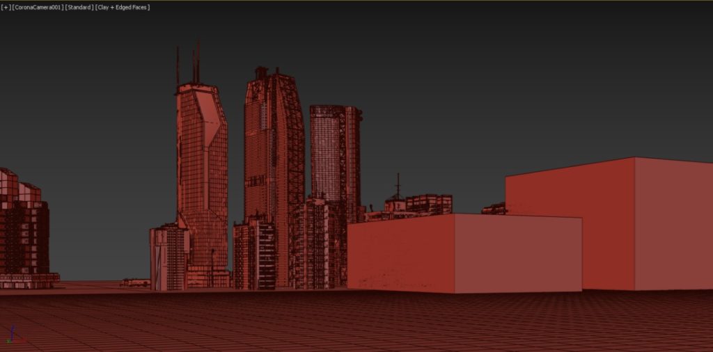
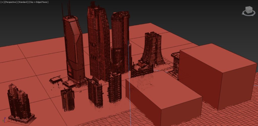
We used some free models from kitbash3d that made our job a lot easier when it came to generating a basic environment.
We knew that the matte load would be very high and, for the viewpoint distance, it was more than enough.
LIGHTING
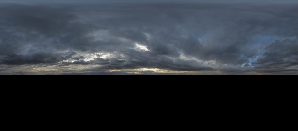
We used a Hdri for the lighting.
We use a cloudy hdri and add a corona sun adjusted at the same point, also using two boxes as flags.
also two boxes acting as flags.
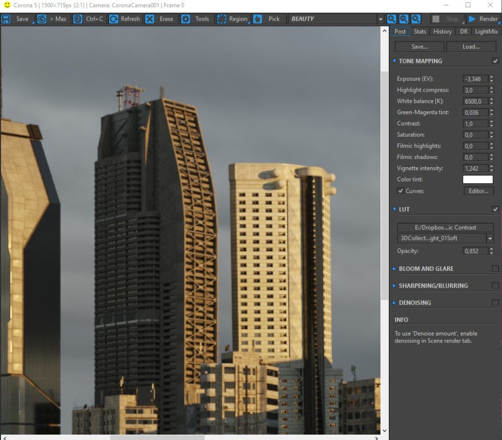
At this moment we adjusted the tone mapping with a Lut. This time we used one of the 3d collective library named ‘3DCollective_sRGB_SoftLight_01Soft’
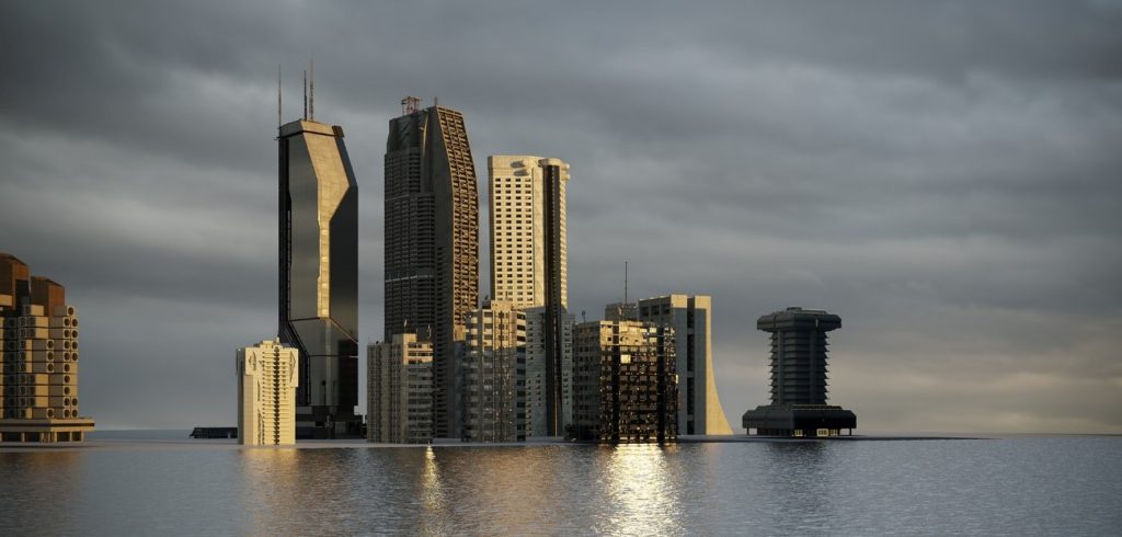
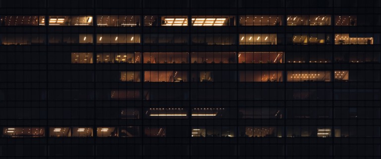
The 3D production was very fast, it was a simply distribution of buildings and we decided the camera point of view.
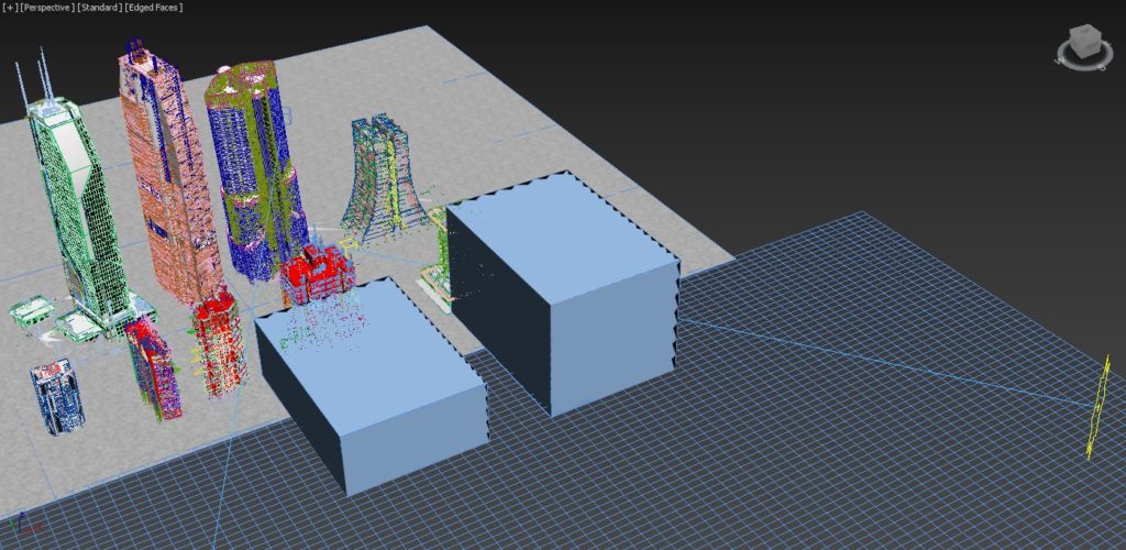
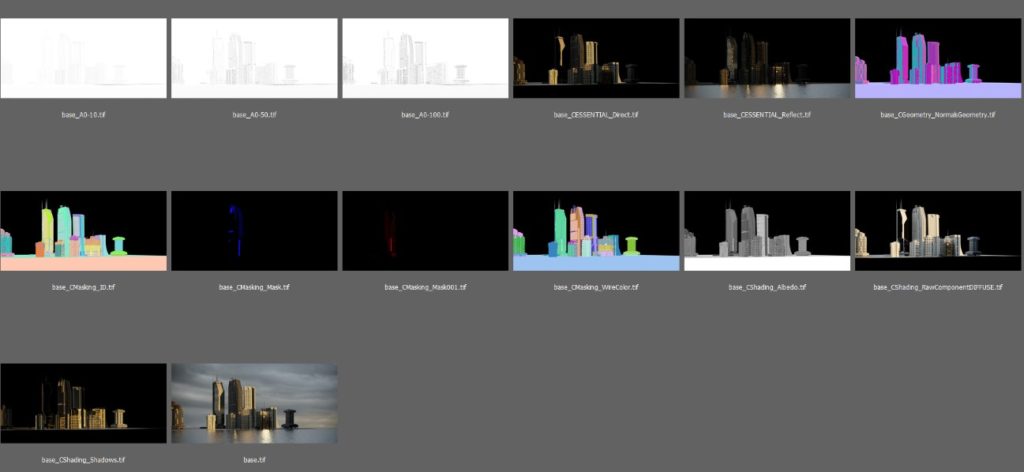
RENDER ELEMENTS
We take several types that will help us later with the postproduction:
-3 different Ambient Occlusion
-Normal passes to mark the volumes of the buildings.
-Reflection passes.
-MaskingID + Wirecolor.
-Direct.
-Albedo.
-Diffuse.
-Shading Shadows.
POSTPRODUCTION
Composition
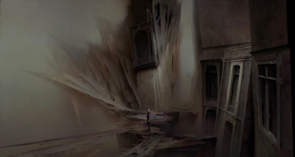
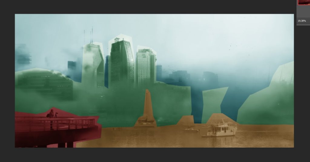
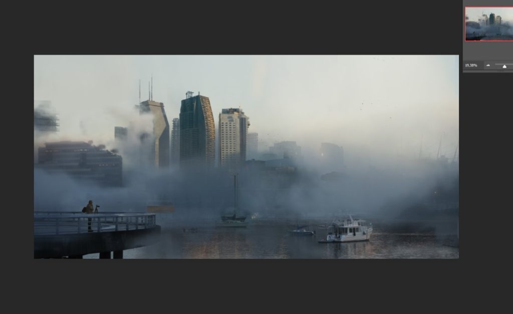
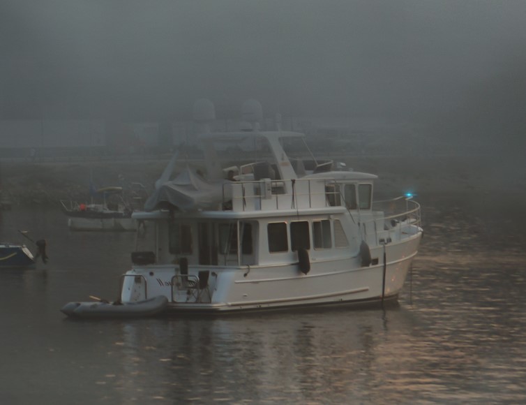
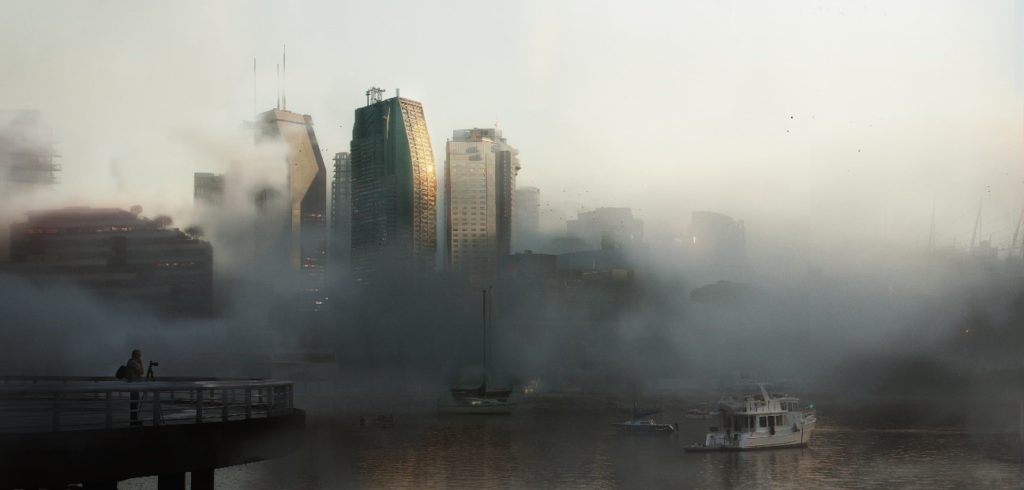
From the beginning we were very clear about the point of view but we also had to generate several feelings. The key was to clearly divide the different to generate deepness, from the base of the harbor to the water, the different boats to our main plane (3D buildings) and background images of building environment to evolve all the 3D.
In this image we have 3-4 planes of depth, generating the darkest close-ups and as we move away we adjust their curves.
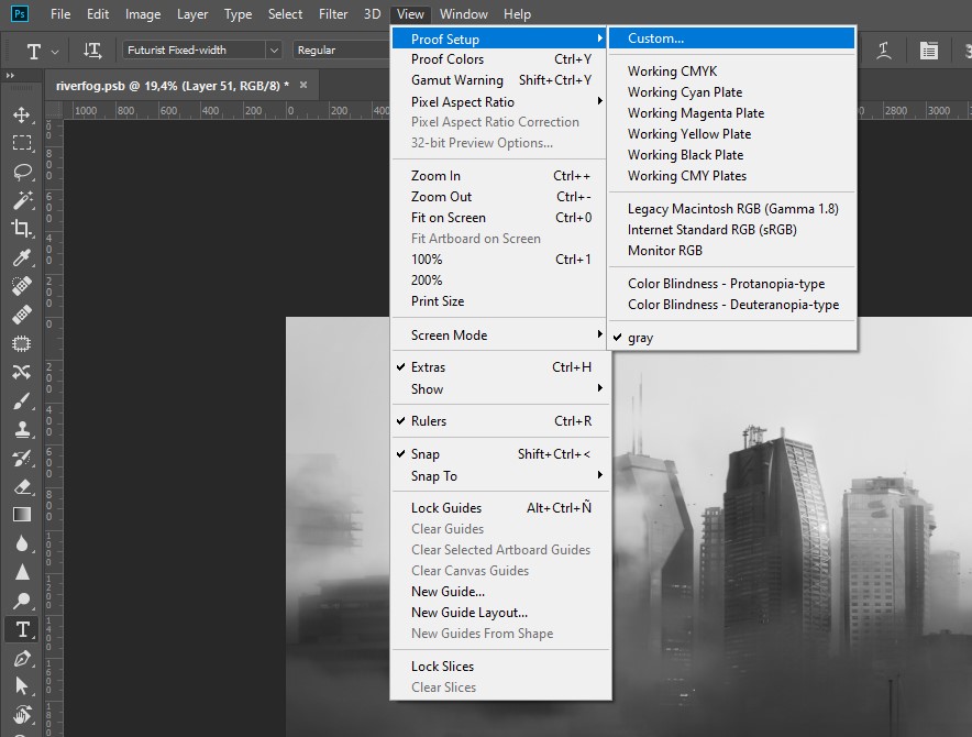
It is very useful for us to see the image in grayscale to adjust the value in each point properly.
Settings to put the image in grayscale using a keyboard shortcut (ctrl+y).
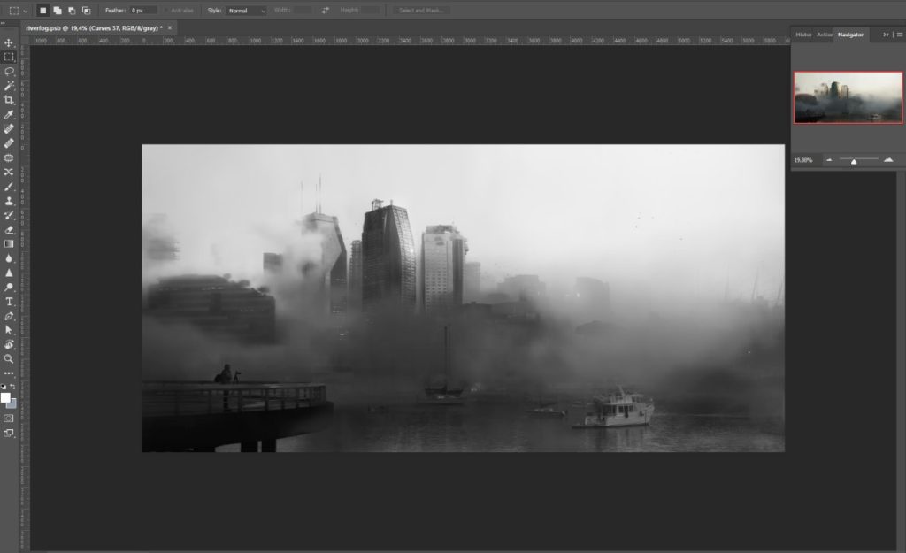
Color and values
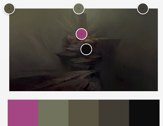
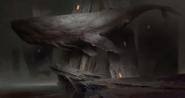
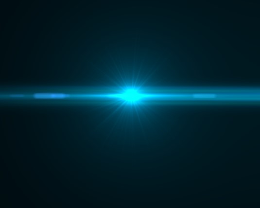
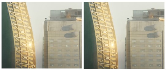
Since we had PIOR images as references, we wanted to give a dirty, dark and sad atmosphere. We can see clearly that idea in the lower part of the image. In the other hand, we decide to contrast the scene with a brighter sky. It was also important to focus the buildings and for that we generated that light spot of the sun in Photoshop, painting by hand with a Color dodge blending mode with black background. It helps us many times to generate strong points of light.
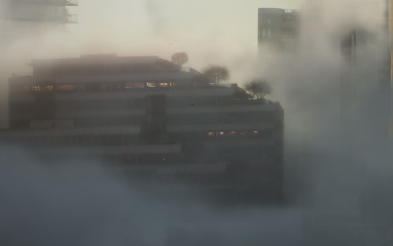
Matte painting / 2D details
We mixed images with total freedom, from large sizes to details, flipping, selecting, discarding… generally the first image we choose is not the one that serves us well, this is one of the most boring tasks of the matte painting, to look for images, luckily there are numerous artists that make many pack of images of their “holidays” and it is very helpful for us.
You can see some examples here and here.
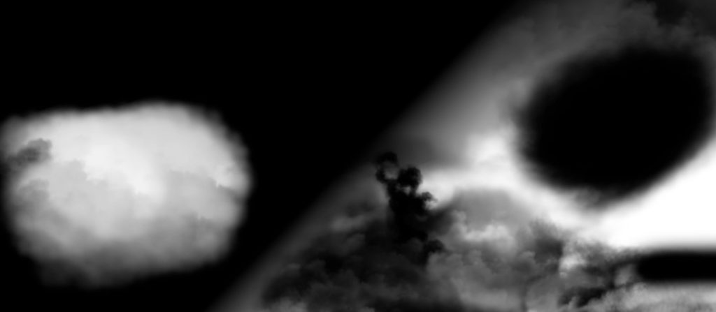
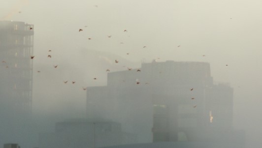
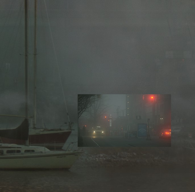
FOG
There are several ways to integrate it, from painting with color and cloud brush, to cutting clouds through exposure or using a fog image and painting the mask with a cloud brush.
POINTS OF LIGHT
In addition to the light source in the main building, we generate other points of brightness through fusion screen modes, which we usually contrast.
DETAILS
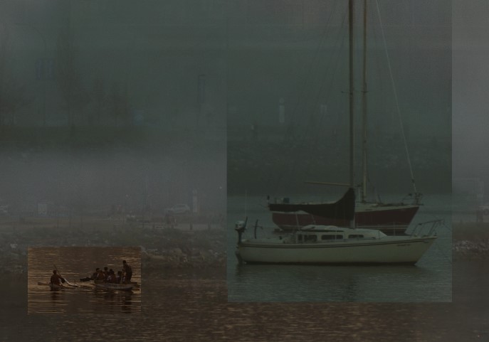
Boat: we mark with it a way towards the buildings and cover that empty part of the image.
People: we needed someone in that foreground, it is true that we use many cutout platforms but this time we cut a person from an image. The naturalness that is generated by trimming the person of a chosen image and not of a library is difficult to achieve.
On many occasions that type of details is almost not appreciated but generally it greatly enriches the image and for this image there were several important parts.
Final touches: we add some contrast and glow, in addition to sharpen, noise, aberration and a bit of lens deformity, all very light so you can fill everything better.
We are very proud of this particular project.
The result fascinates us!
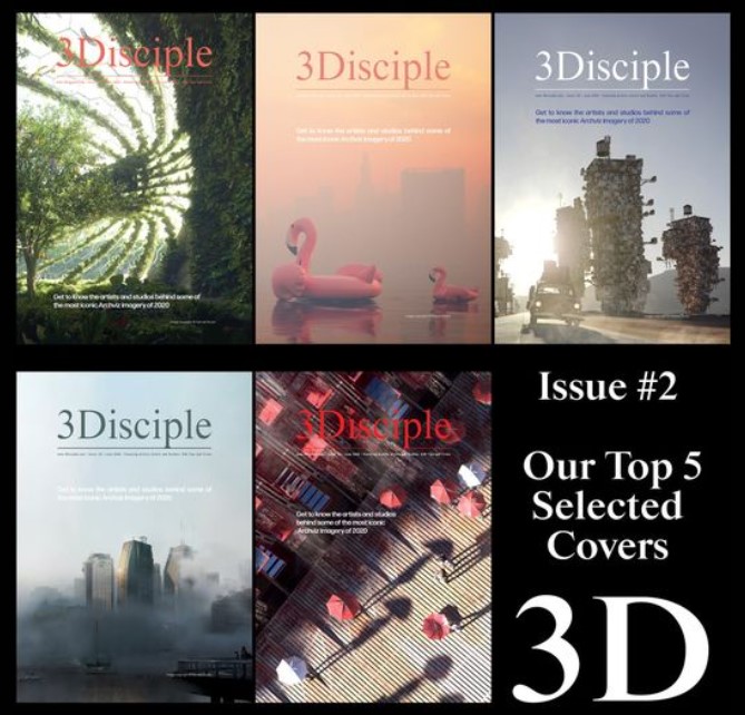
In addition, this image was a runner-up for the cover of 3Ddisciple magazine #2.
Want to see the creation process?
Don’t miss this video!
You can find much more in our website and social media profiles.